Do you lack the time to create the perfect bullet journal weekly spread for your needs? With our free bullet journal app you will have the perfect template in under 2 minutes. Instant download!

Although the bullet journal weekly spread is not one of the four core modules, many people like to create a weekly spread. In the Bullet Journal Method, Ryder Carroll, creator of the bullet journal, refers to such spreads as “Custom Collections”. These are spreads that people add according to their unique needs and preferences. A weekly layout can be helpful when you have a lot going on and a monthly spread will not suffice. You can also use it when you don’t have a lot going on and a daily spread for each day is unnecessary.
Our free bullet journal app, enables you to add widgets with a click of your mouse. You can select any weekly layout and add a habit tracker, water intake tracker, gratitude list, grocery list, or any other widget. You can also edit the text so your week begins on a Sunday or a Monday.
Bullet Journal Weekly Spread Ideas
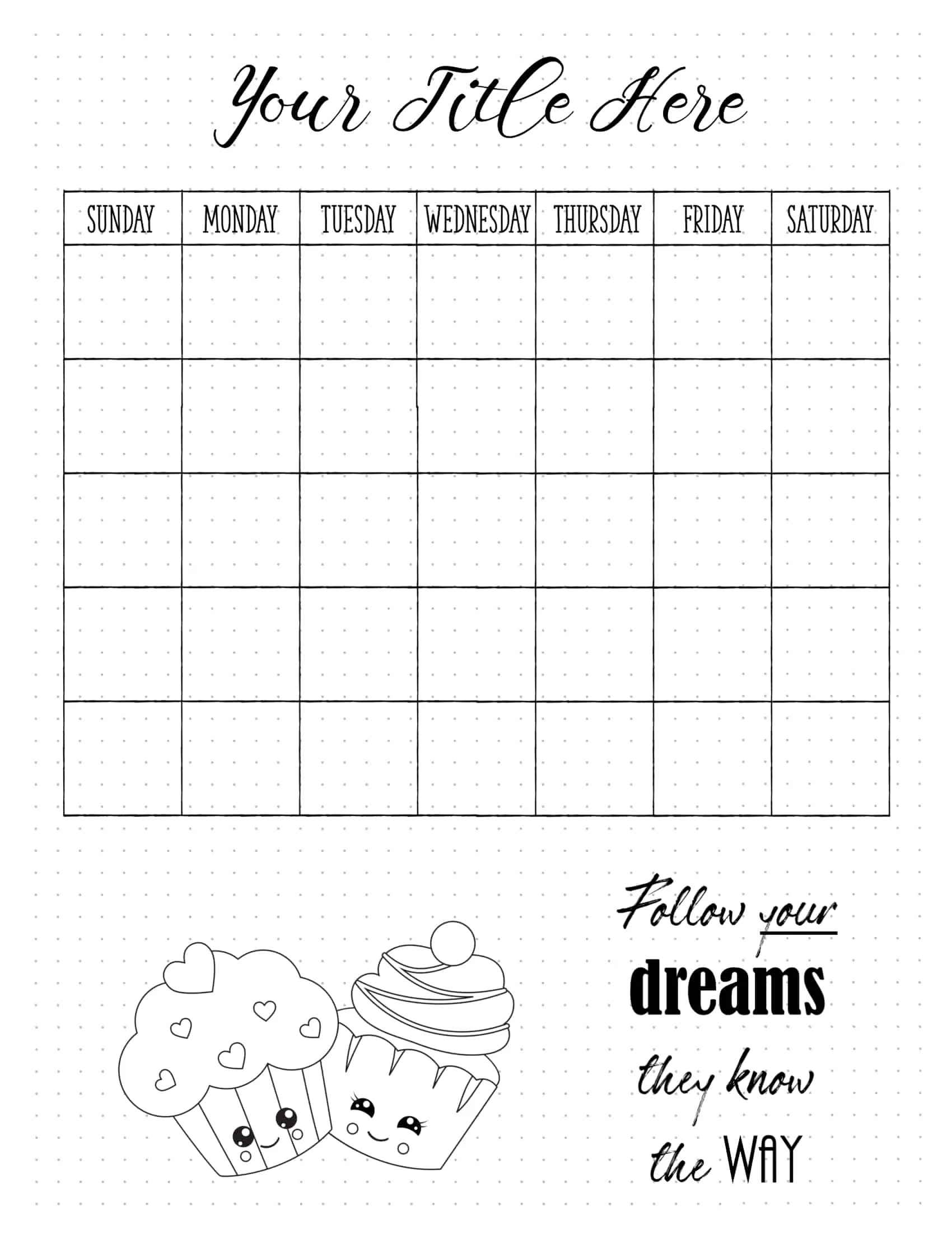
You can create the following bullet journal weekly spreads with our free BuJo app. Either use each BuJo weekly spread as-is or customize the layout. There are many options to section the page. You can add blocks to create any layout you want. You can also add widgets, doodles, embellishments, or watercolor elements.
Bullet Journal Calendar
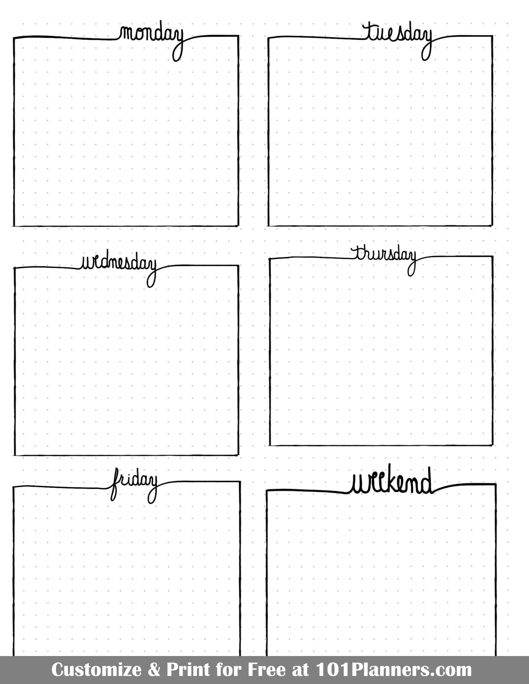

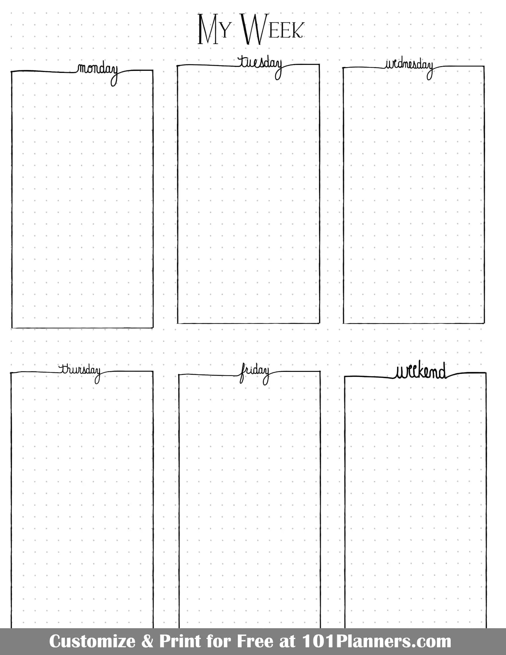


This weekly spread BuJo style has two sections: one for work and one for home. This helps you distinguish between personal and work tasks and events. There is also a blank template with two sections if you want to separate school and home or tasks and events.


Add doodles with a click of your mouse. Change the keep to start on a Sunday or Monday.


Bullet Journal Weekly Layout
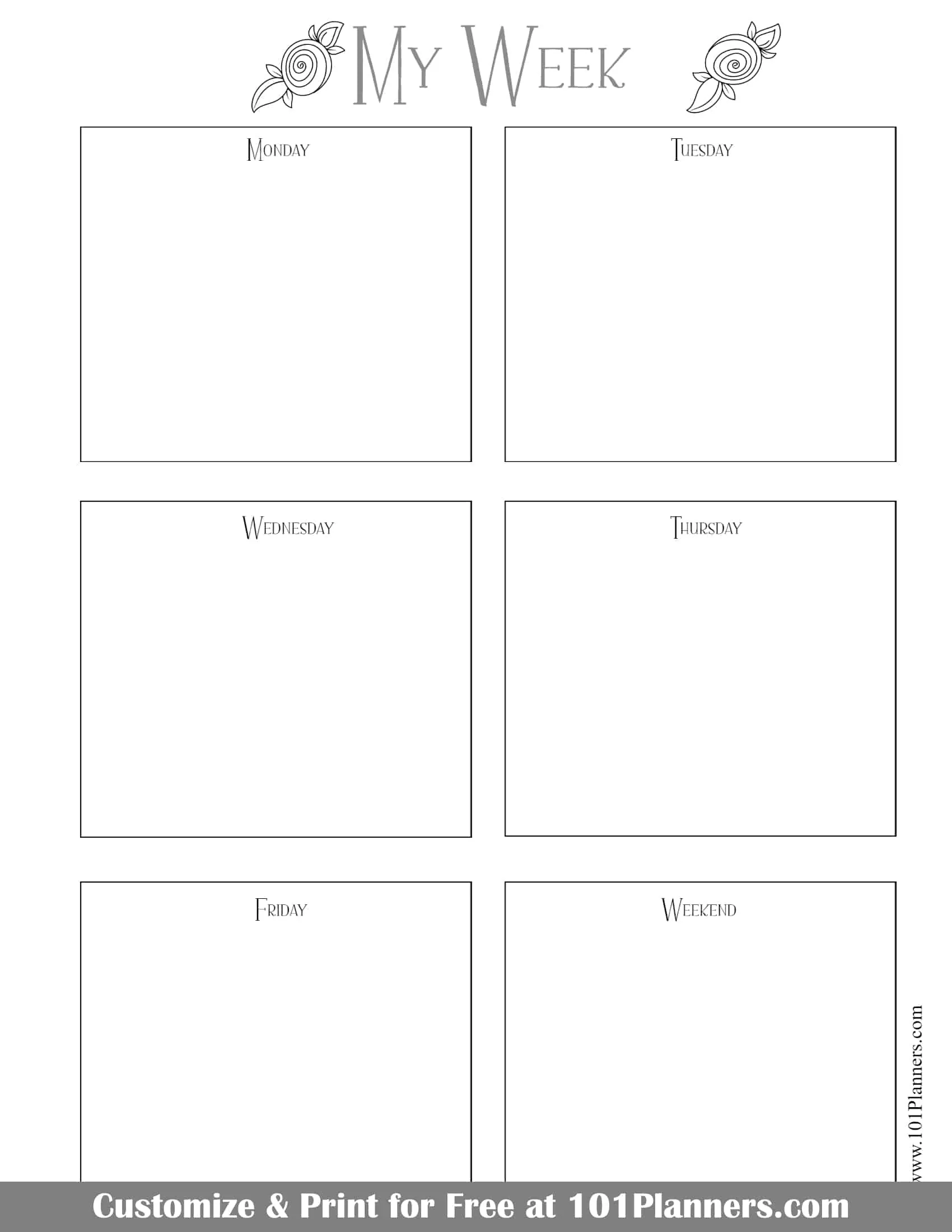
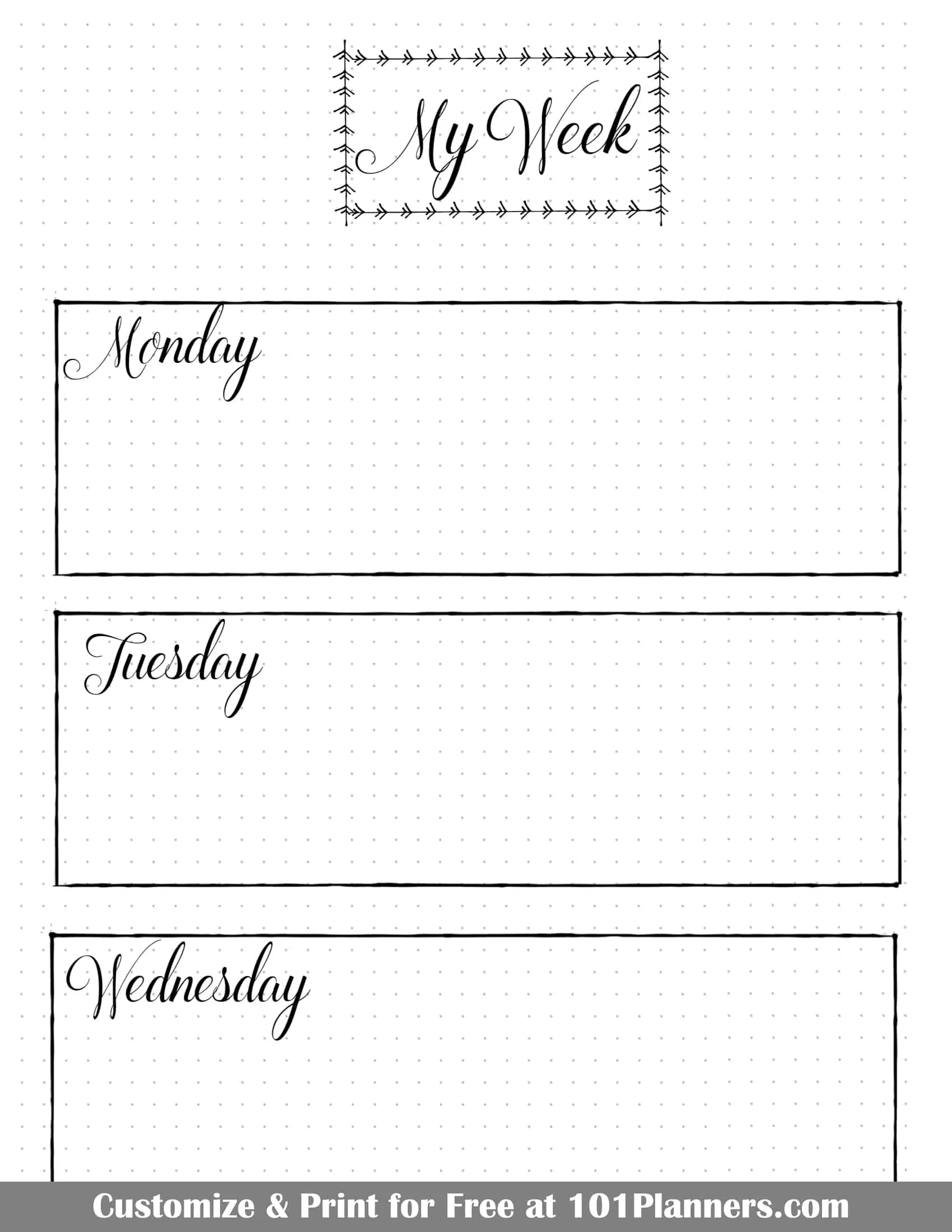
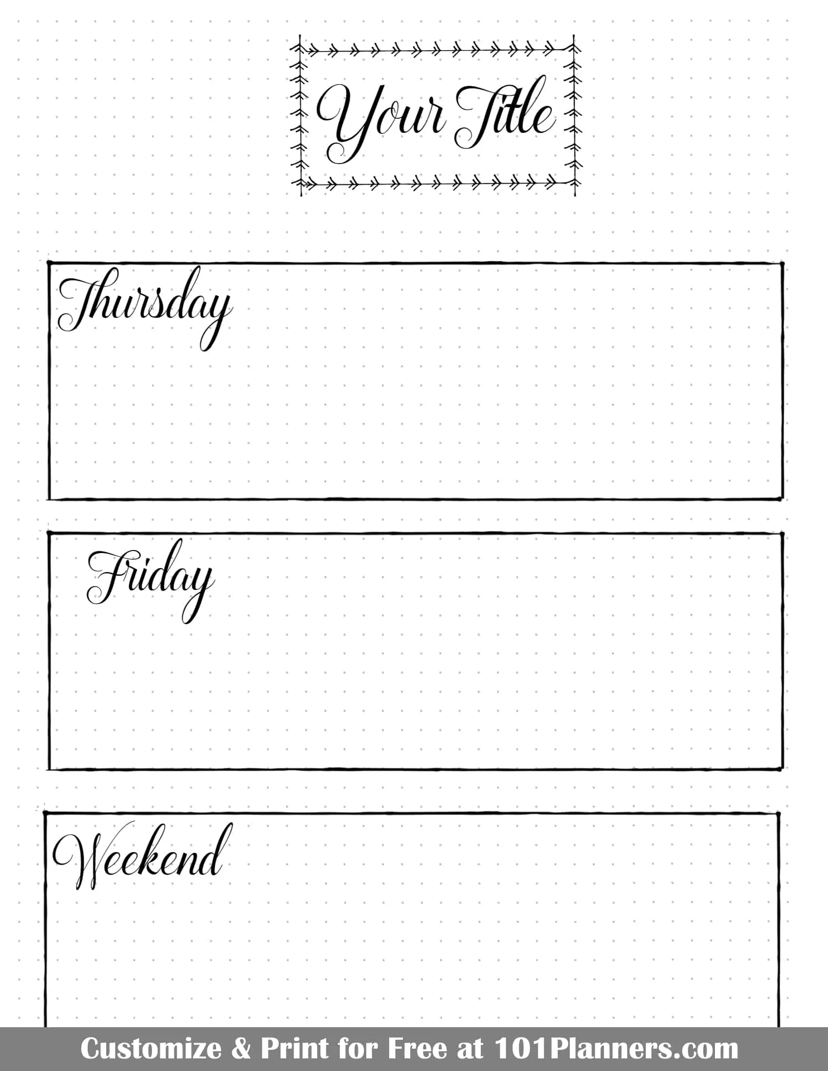
The weekly bullet journal spread is usually one or two pages. You can have a section per day or use one section for the weekend. There are many optional layouts above. Either use a layout as is or customize it. You can also start from scratch and add blocks to section the page any way you want.
We also offer a weekly calendar that is not in BuJo format.
 My name is